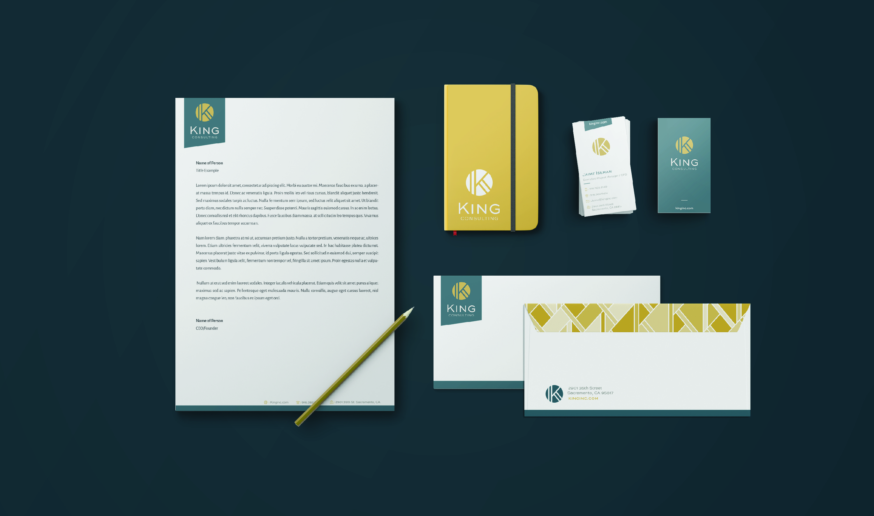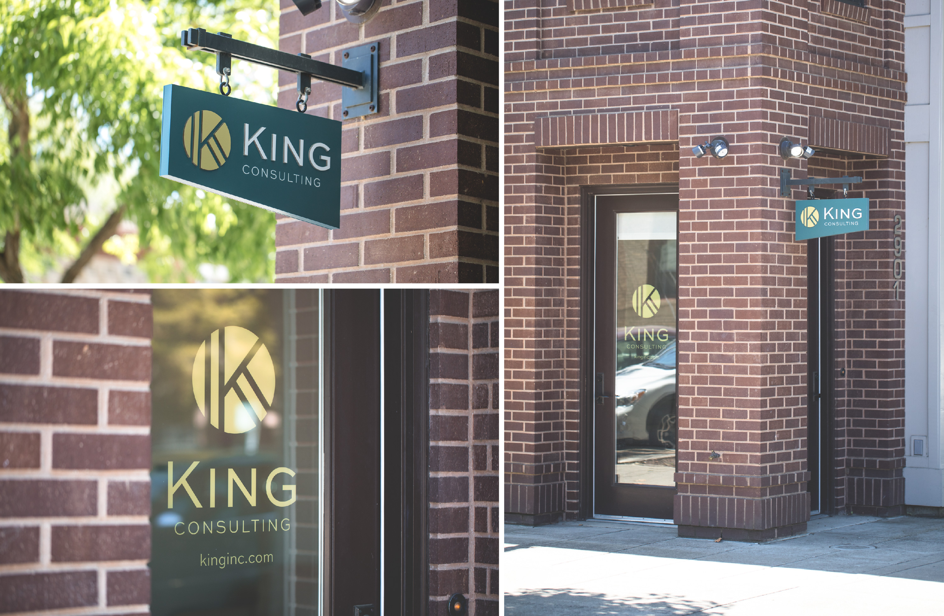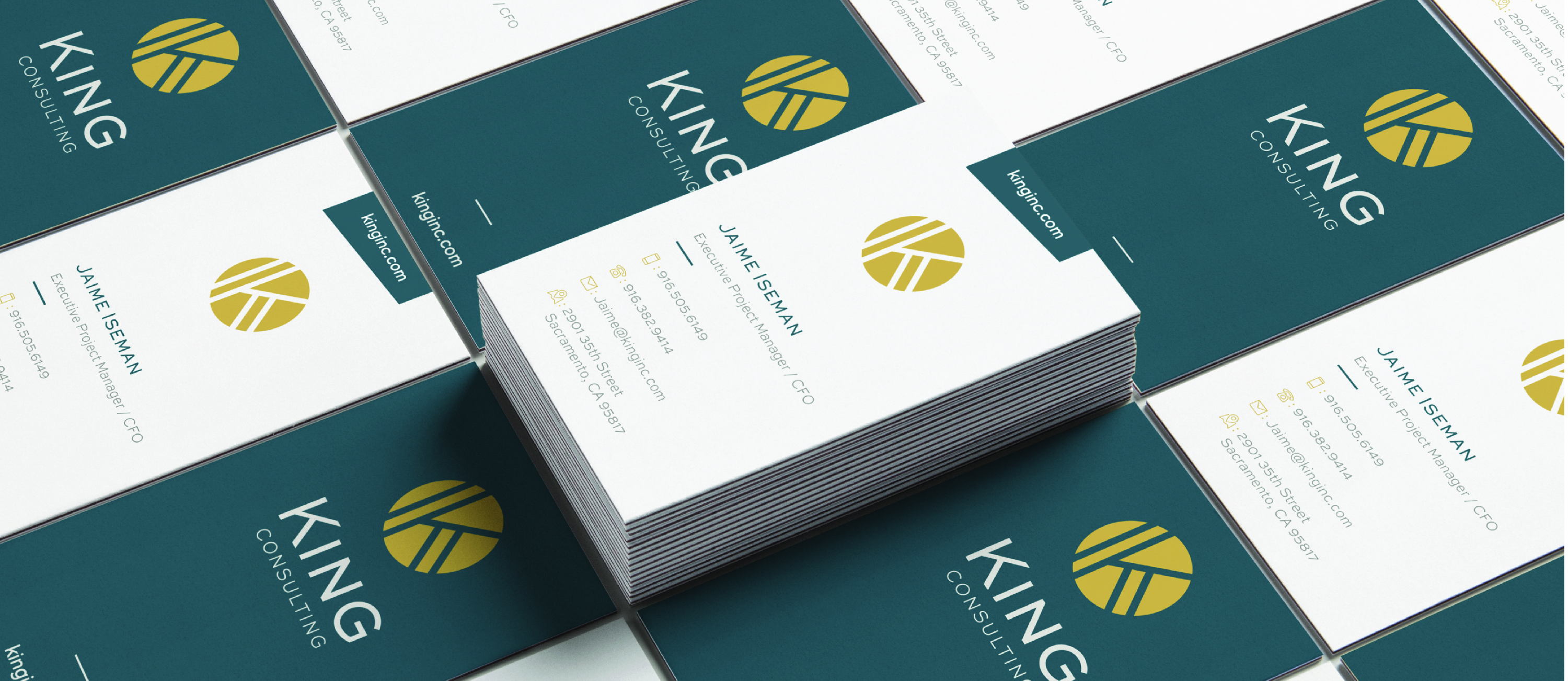

King Consulting came to us wanting an updated brand, logo, and website. Their firm is professional, attentive, but also has a distinct personality — approachable, modern, and extremely competent. The logo itself is very minimal and bold, showcasing a stylized K, which is strong enough to stand on its own and lends itself really well to everything from promotional items, building signage, and small printed materials.


TThe website utilizes a strong color scheme to reinforce the brand, but mainly a lot of work went in to restructuring the content to be user friendly and search engine friendly. The site itself is not large, but contains lots of useful information and resources for the firm’s clients and future clients. One neat page on the site is the social media news page — which combines all of their social accounts into one pretty feed.


